
Accuinsight+ 3.0: Data Analysis for Non-Experts
Accuinsight+ is an enterprise platform that brings several data analysis tools together. The goal was to make it easy to use not only for experts but also for people who can't code. I led the UI design across the product and redesigned its core screen, the Workflow: I cleaned up complex controls, made nodes easier to read, and introduced a Guide Mode that walks people through the analysis step by step.
Problem
Can non-experts use a tool built for experts?
Accuinsight+ 3.0 merged several separate data analysis products into one platform. The Workflow, which connects each step of an analysis as nodes, from loading data to training a model, became the core screen.

The existing Workflow was built for data analysis experts. But the new product had to reach citizen data scientists with no coding experience.
The problem was that the product's features and steps were so complex that even the team couldn't clearly say where users struggled.
Research
Finding problems by using it ourselves
Before designing, I started by understanding the whole data analysis process. My teammates and I became users, went through an analysis from start to finish, and organized it into a user journey map. We analyzed competing products the same way and compared the flows.
I then interviewed in-house data analysts and the consultants who worked with our clients, to confirm the difficulties people faced in real use.
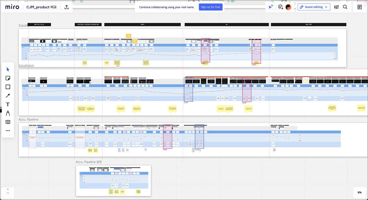
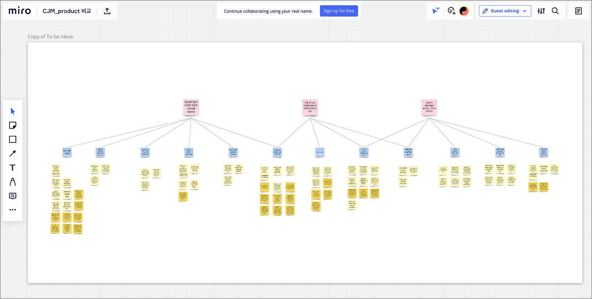
The research revealed three main problems.
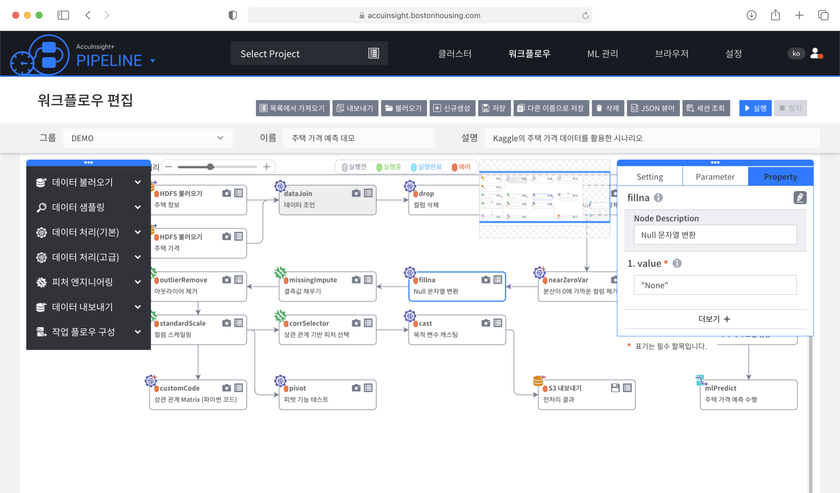
1. Too many options at once
Panels for every function stayed open regardless of the selected node, covering most of the canvas.

2. Nodes hard to tell apart
Identical-looking nodes in seven categories and Spark command names like regexp were hard to understand for people who can't code.

3. Tedious node connections
I repeatedly saw analysts struggle to find the connector and line up nodes by hand. No one had raised it as a problem.
Design
Show less, guide more
To solve the three problems, I reduced what appeared on screen and made the next action easy to see.
1. Showing only the options you need
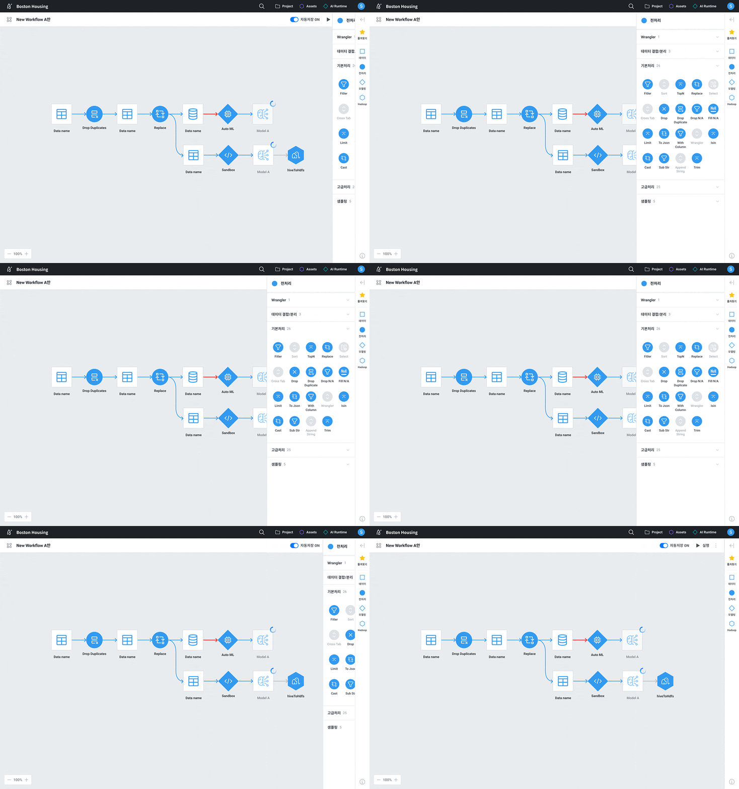
I reviewed every function and sorted the controls that had to stay on screen from those that could move to a context menu.
Buttons now appear according to the selected node's state, cutting the choices visible at once by about 80%. The options panel can also collapse, making the canvas about 75% larger.

2. Nodes you can tell apart at a glance
I explored a wide range of node shapes, colors, and layouts. Icons looked easier to recognize, but to confirm it, I surveyed 46 colleagues in departments working on Accuinsight+ on three designs.

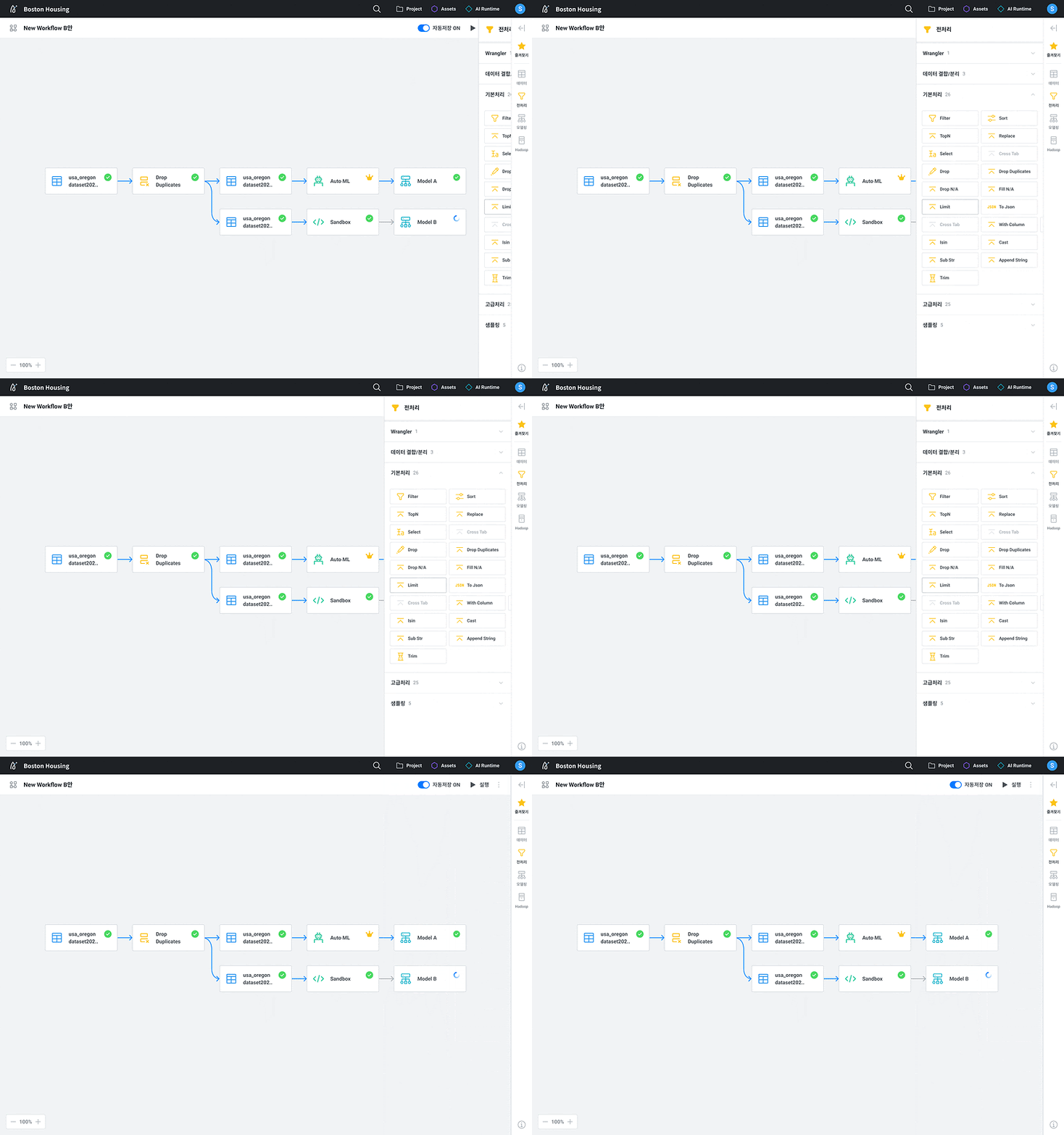
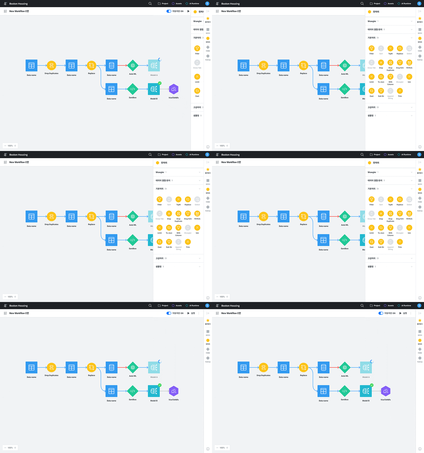
~72%
chose an icon design (A+C)
Option C, with color by function, got the most votes, but some found all the colors tiring.
So I merged seven categories into four and changed card nodes to icons. Technical terms became names that are easy to understand, and nodes with unfinished settings are dimmed to show their status.

3. Node connections that guide the next step
Previously, people had to place a node and find the connection point themselves. I designed a connection handle that appears on hover.
Non-experts also tended to add nodes one at a time rather than plan the whole flow first. To match this way of working, I proposed Guide Mode.
When someone picks the next task from a category menu, the new node is placed automatically and connected to the previous one.
After the behavior was confirmed with a prototype, Guide Mode replaced Free Drop as the default.

Impact
A new Workflow shipped to enterprise clients
Accuinsight+ 3.0 shipped to enterprise clients with Guide Mode as the default and was presented at SK Tech Summit 2021. You can see the Workflow I designed from 4:40 in the SK Tech Summit session video. At a sales meeting, a prospective client even asked our consultant who had designed the Workflow screen.


Reflection
I learned that in expert tools, the things people do out of habit can make problems harder to spot.
By going through the analysis process myself and watching experts work, I found discomforts that even users couldn't clearly describe. Turning one-by-one node connections into Guide Mode in particular taught me that understanding what people actually do matters more than building what they ask for.