
Auto Layout: A Property Panel Redesigned Around a New Feature
ProtoPie's property panel had lost its consistency as features were added over the years, and enterprise customers kept asking for improvements. I used the Auto Layout launch to rework the panel's design system and redesign its layout and controls. Since about 80% of users start their designs in Figma, I kept the patterns they already knew, and validated and adjusted ProtoPie's own features through user testing.
Problem
Auto Layout was hard to fit into the old panel
Enterprise customers kept requesting Auto Layout improvements. When I gathered and analyzed the requests, many were for things they already used in Figma: resizing to fit content, setting padding and gaps, and reordering layers.

But Auto Layout is closely tied to the existing Size, Position, and Constraints. The panel had gained features for about ten years without consistent design rules, so simply adding one more could make it harder to use.
So I decided to improve the existing property panel along with the Auto Layout launch.

1. Inconsistent layout
Each section had its own grid, margins, and control alignment.
2. Poor accessibility
Color contrast and click targets fell short of accessibility standards, and some controls had no hover feedback.
3. Unfamiliar Constraints
Constraints didn't behave the way people coming from Figma expected.
Design
Bringing many designers' ideas into one panel
The biggest question was how far to follow Figma. ProtoPie has many properties, including motion, that don't map one to one with Figma.
I asked every product designer to propose ideas and explored a wide range of directions. Then I combined the strengths of each proposal, developed the design further, and narrowed the direction over five or more focused reviews.
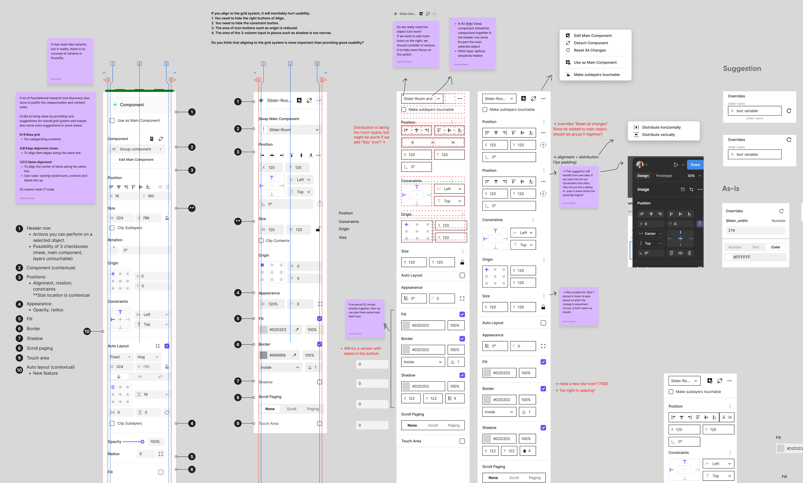
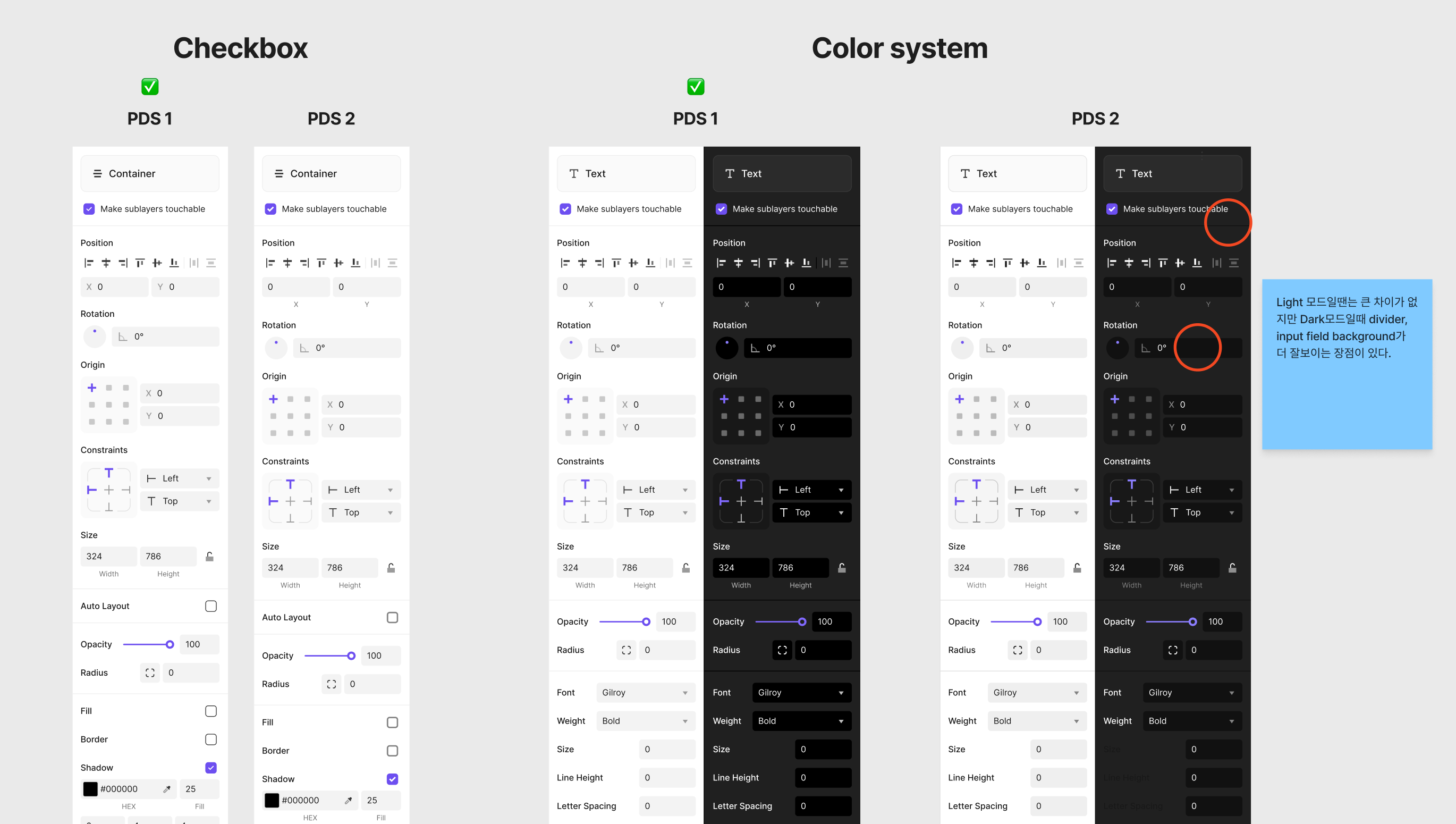
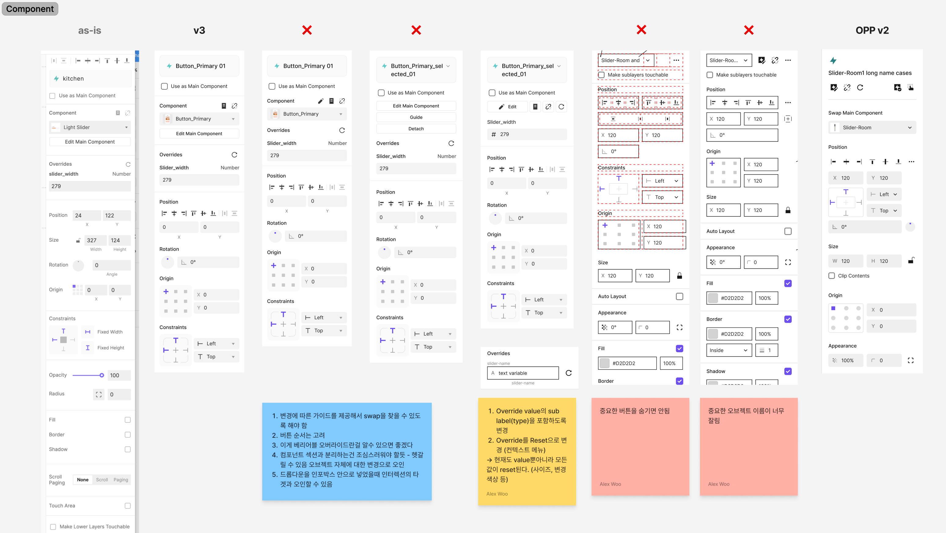
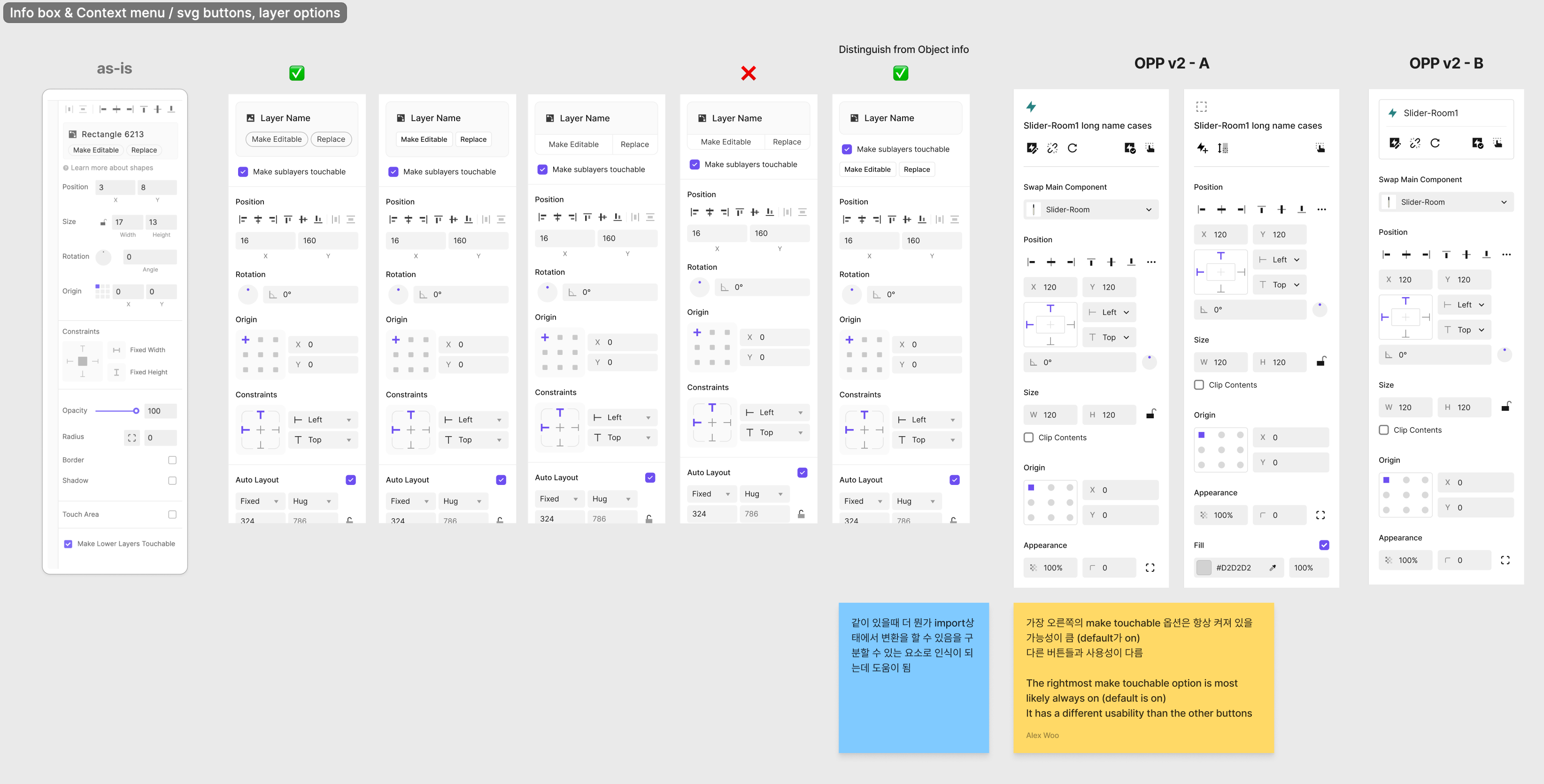
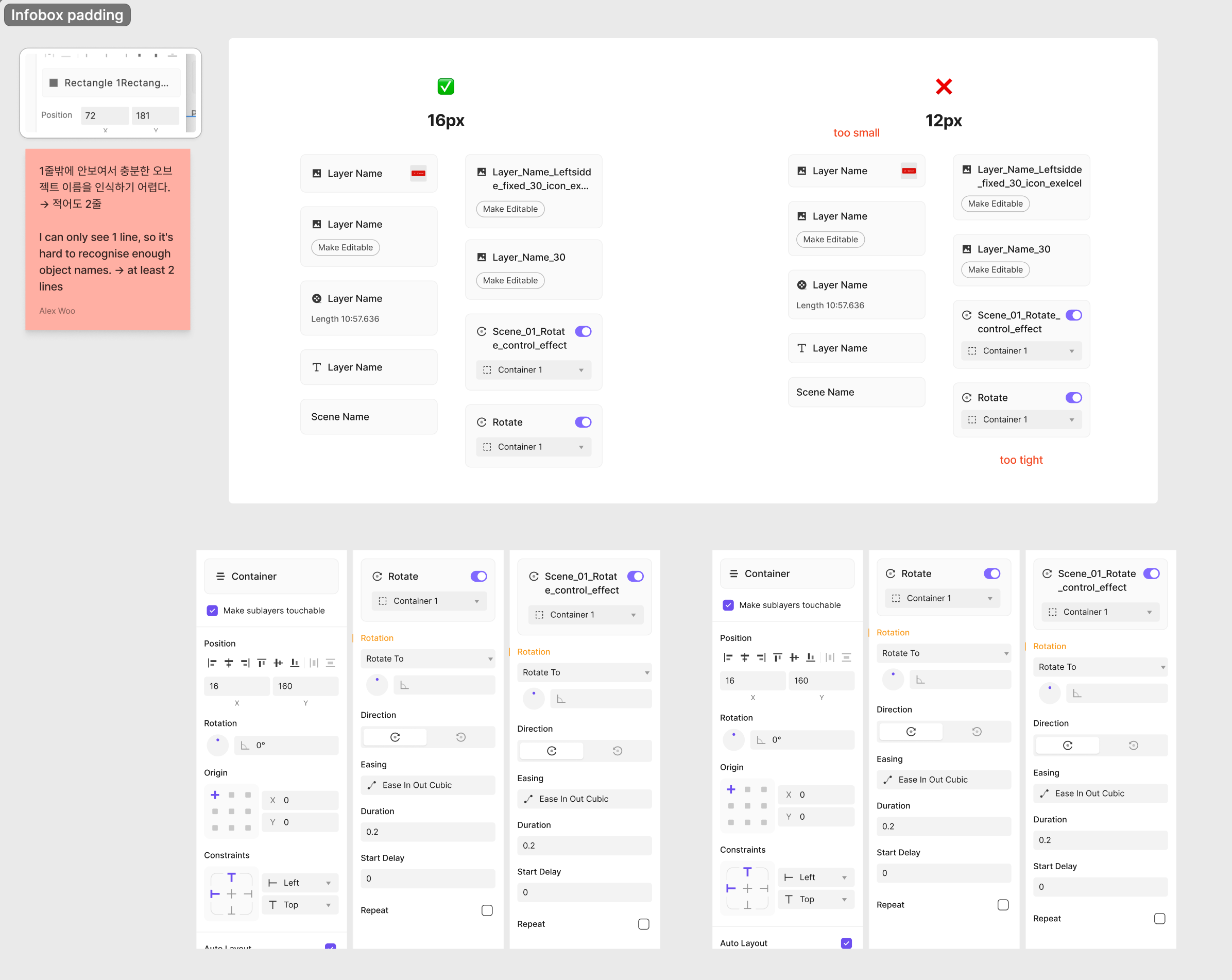
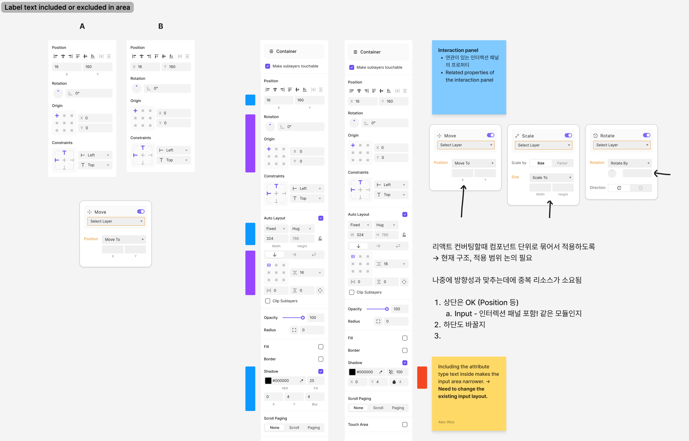

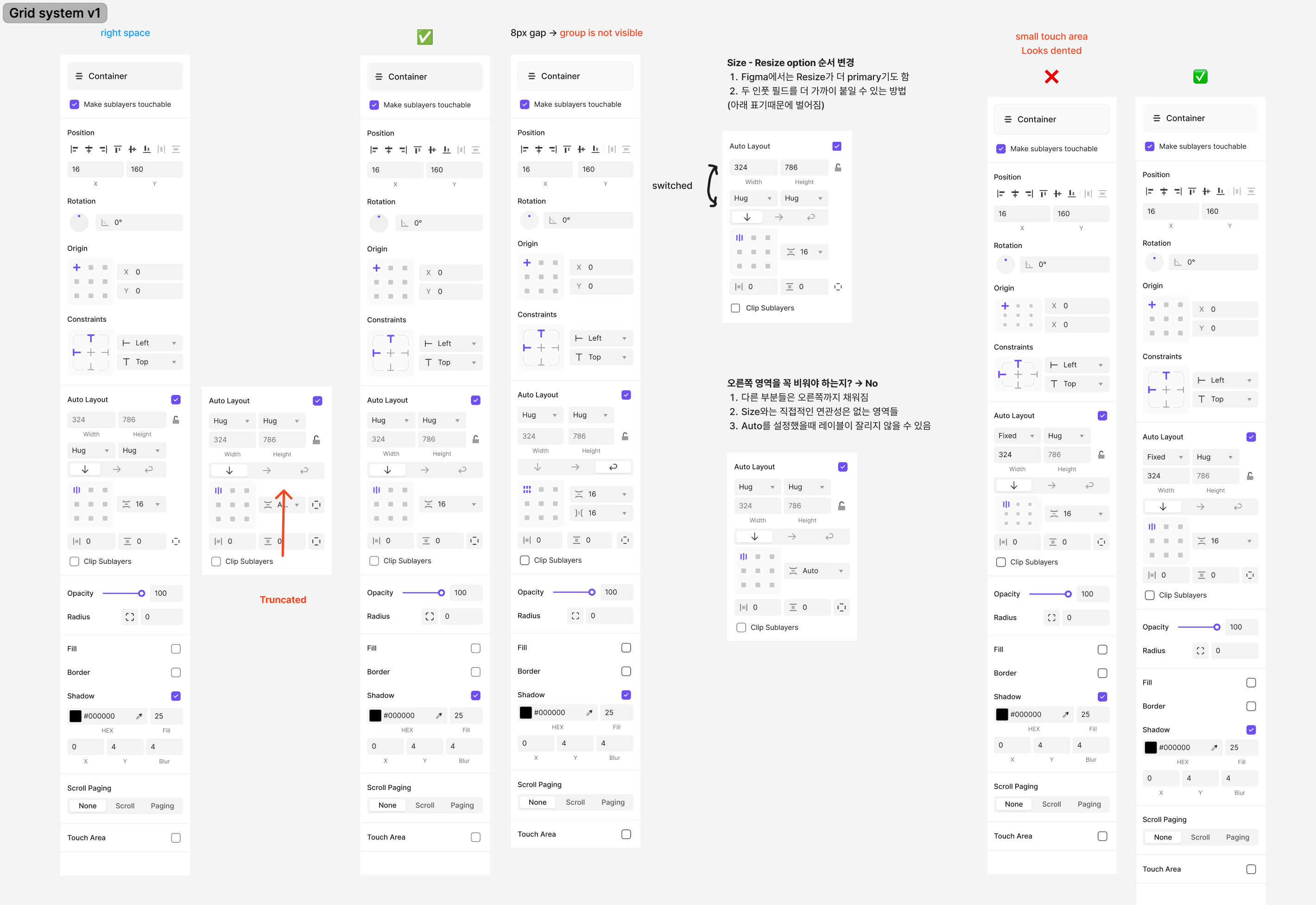
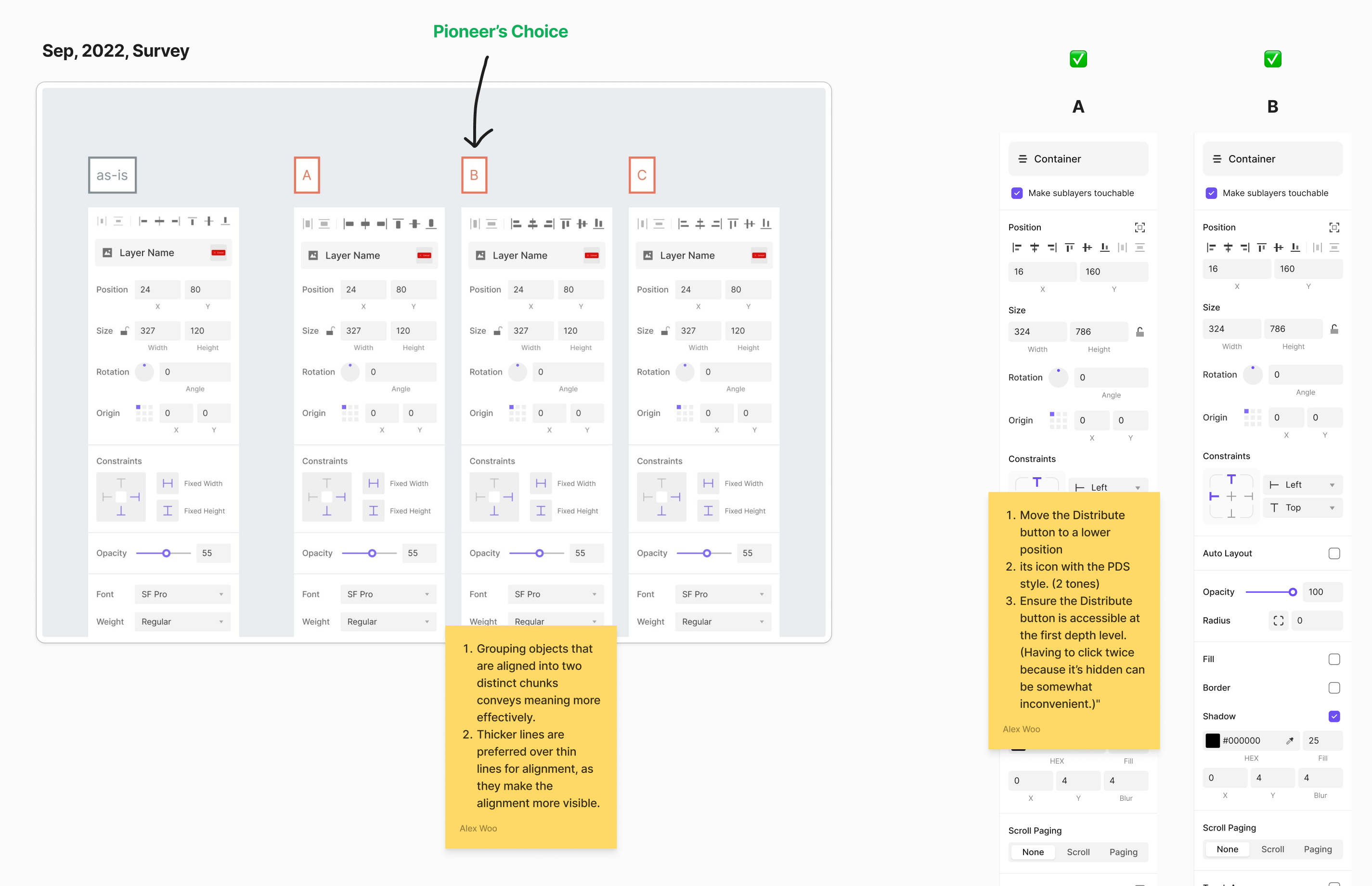
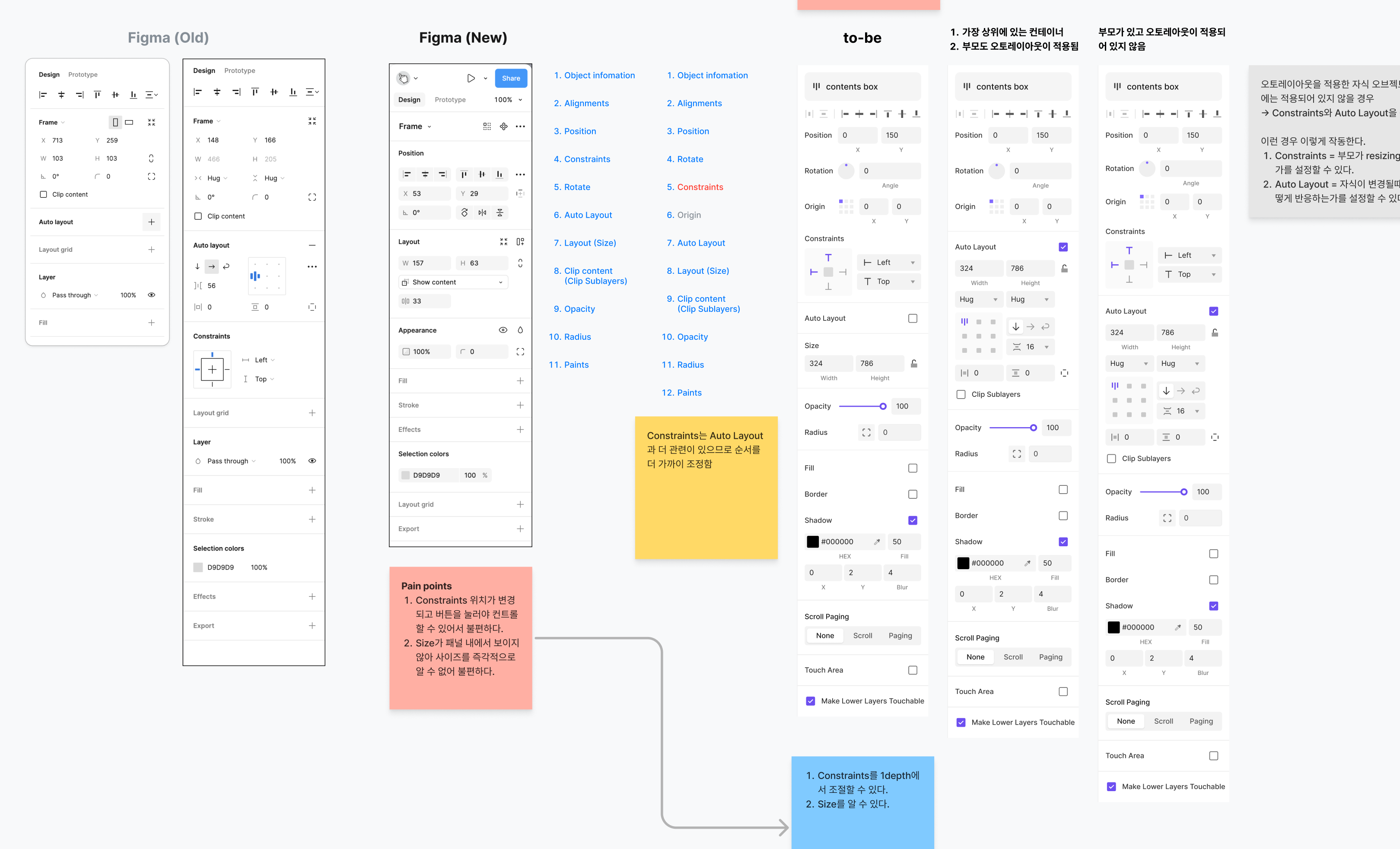
Idea exploration and design reviews with every product designer
For features that match Figma, I stayed as close as possible to the familiar placement and controls. For features unique to ProtoPie, I also considered how existing users already work.


Applying consistent rules across the panel
I didn't stop at adding Auto Layout. I also fixed the problems in the existing panel.
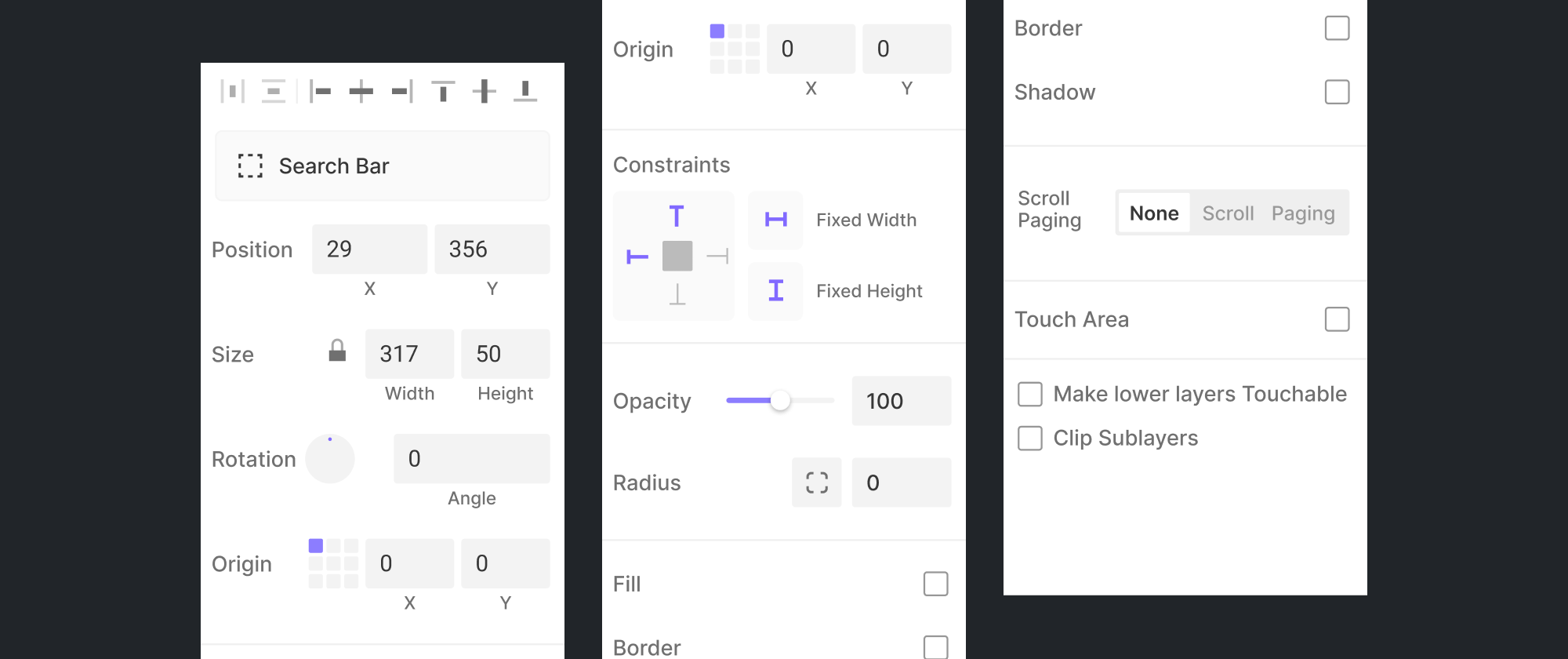
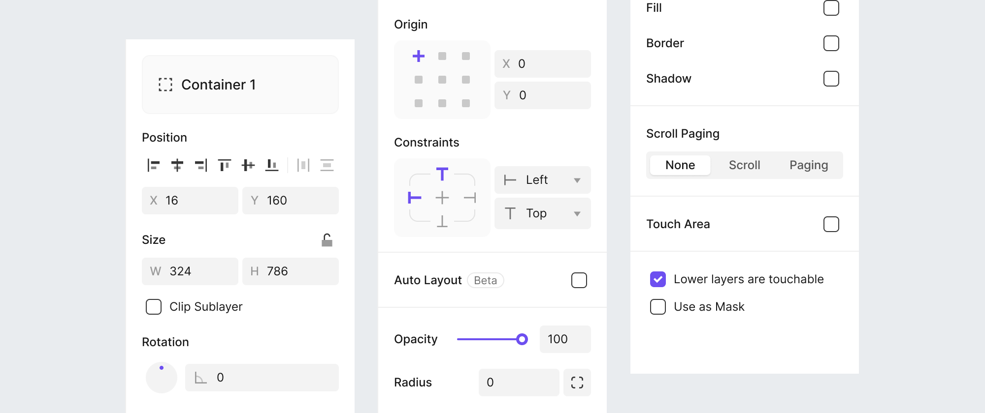
1. Consistent grid
Every section now shares the same grid and margins. Alignment controls are reordered by priority, and their icons are easier to recognize.

Size, Position
2. Better accessibility
Click targets and color contrast now meet WCAG, and units are clearly shown for values. I also reworked hover states so it's easy to tell what can be controlled.

Origin
3. Familiar Constraints
Constraints now follow the controls Figma users know, with resizing split into a separate control.

Constraints
I documented the grid and spacing as reusable design rules and applied them across the panel.

Validate
The familiar way wasn't always the right answer
I built seven test scenarios as Figma prototypes and validated usability with internal participants in Maze.
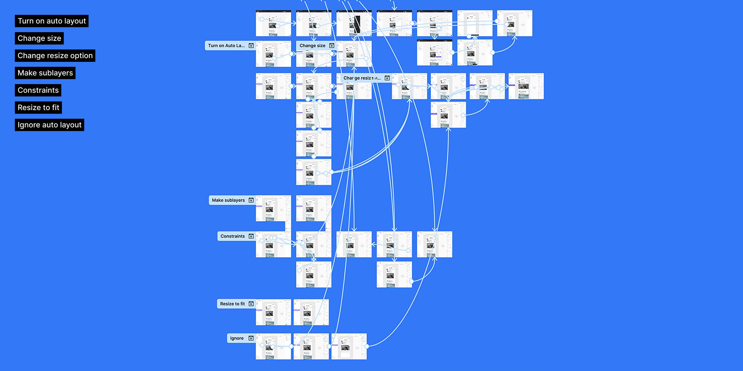
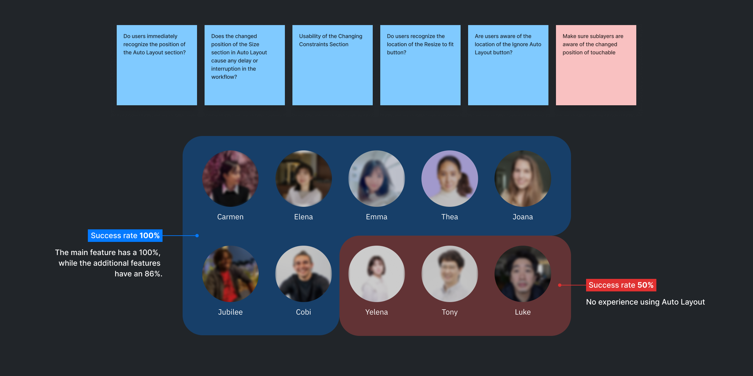
Participants familiar with Figma completed every key task. But in an extra task, where the layer option had moved to a spot similar to Figma's, most couldn't find it. People used to the existing ProtoPie had the hardest time.
Based on this result, I moved the layer option back to its original place. Reflecting patterns new users know matters, but so does protecting the experience existing users have built up.
Understanding the spec by using it, not just reading it
Auto Layout has many properties working together, so documents alone couldn't convey every behavior.
Before development, I ran four hands-on sessions with engineers and QA. We checked the behavior by manipulating real objects, and later reviewed questions from QA together.
As a result, QA understood the feature and wrote the test cases themselves. The team could validate independently, without a designer reviewing every case.
~3,000
test cases written by QA
Impact
High adoption among enterprise customers
Auto Layout launched in beta in ProtoPie 9.0 on December 18, 2024 (release notes). It supported design and Figma import, and I checked usage data after launch.
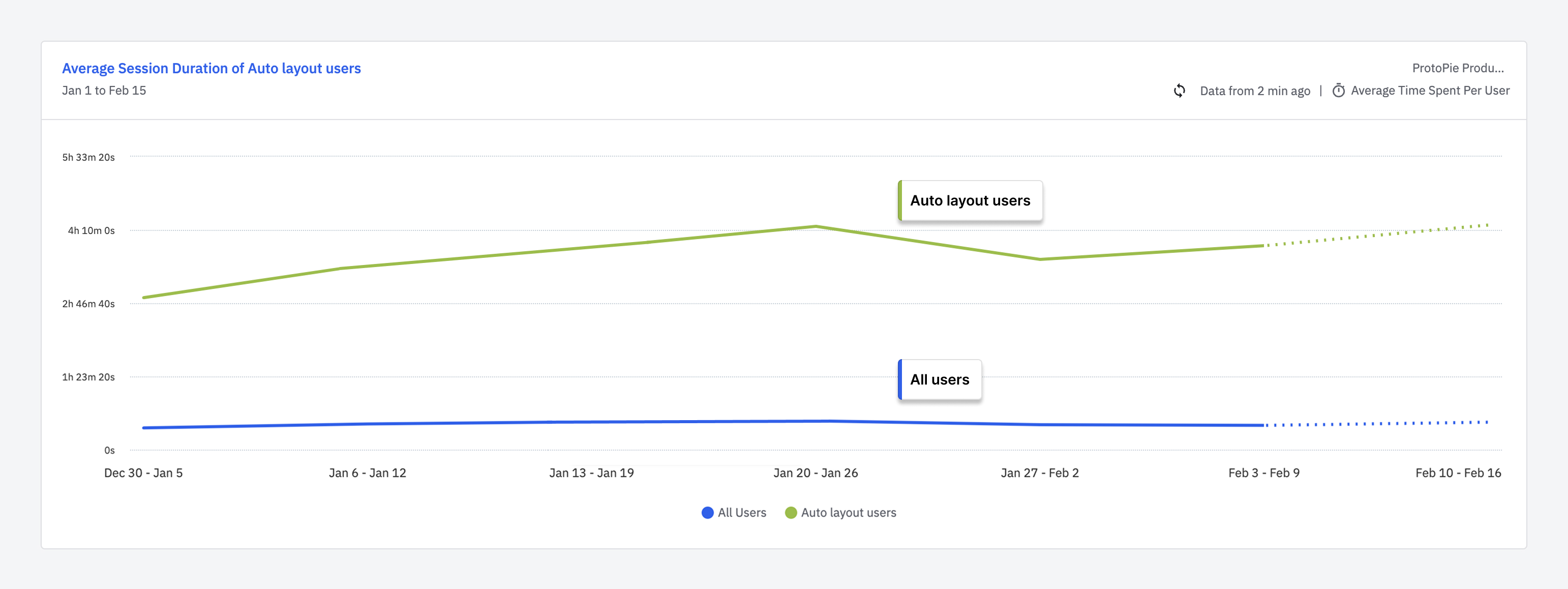
Over the first six weeks of 2025, people who used Auto Layout had longer average sessions than users overall. Adoption was highest among enterprise customers, the group that had asked for the improvements.
50%
Enterprise
28%
Pro
27%
Basic
3%
Free
Share of users on each plan who used Auto Layout
The difference in session time can't be attributed to Auto Layout alone. People who already used the product often may simply have tried the new feature first.
Reflection
This project was about deciding how much of the existing experience to keep while introducing something new. Reflecting Figma's familiar patterns, then adjusting them for ProtoPie through user testing, was the key.
I also learned that a design lead's role includes bringing many designers' opinions into one direction, and helping engineers and QA understand a complex feature together.