
Astell & Kern: Giving Sound a Visual Sense of Space
The A&ultima SP1000 was Astell&Kern's first flagship model. Redesigning a UI that had barely changed for years, I explored how sound could be expressed visually. I used depth, light, and layers to convey the sense of space in sound, and brought the character of the brand and hardware into the interface. I designed the UI across the whole product, from music playback to boot, system settings, and device connections.

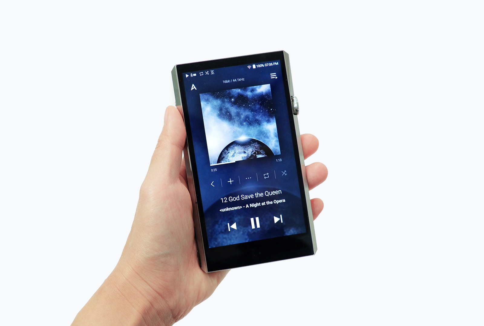
A system UI for the whole device
Beyond the music playback screens, I designed the system UI that responds to the device's state and to people's actions. Across boot and shutdown, battery and charging states, system settings, and connections to external devices, the goal was for people to clearly understand the current state and move naturally to their next action.
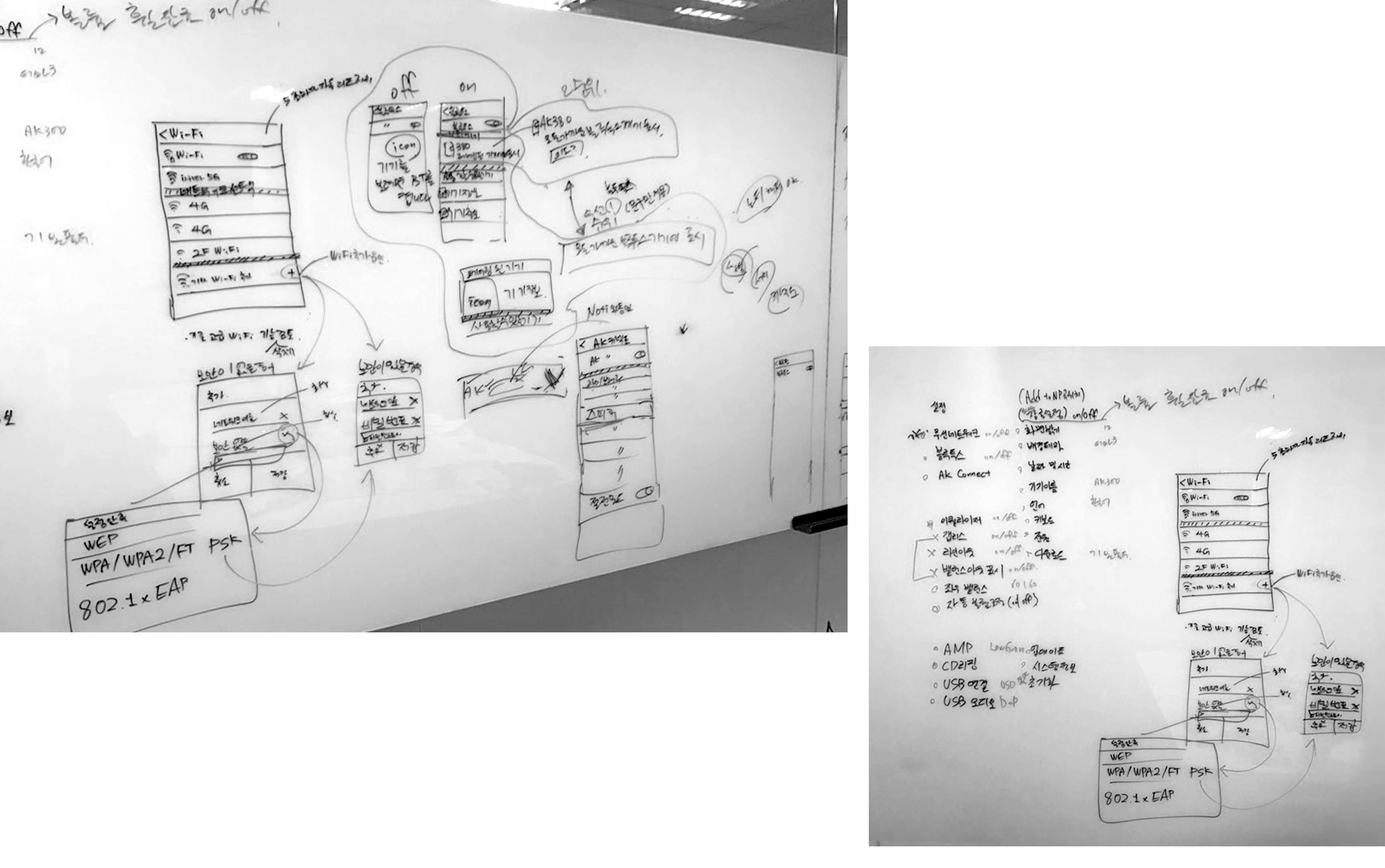
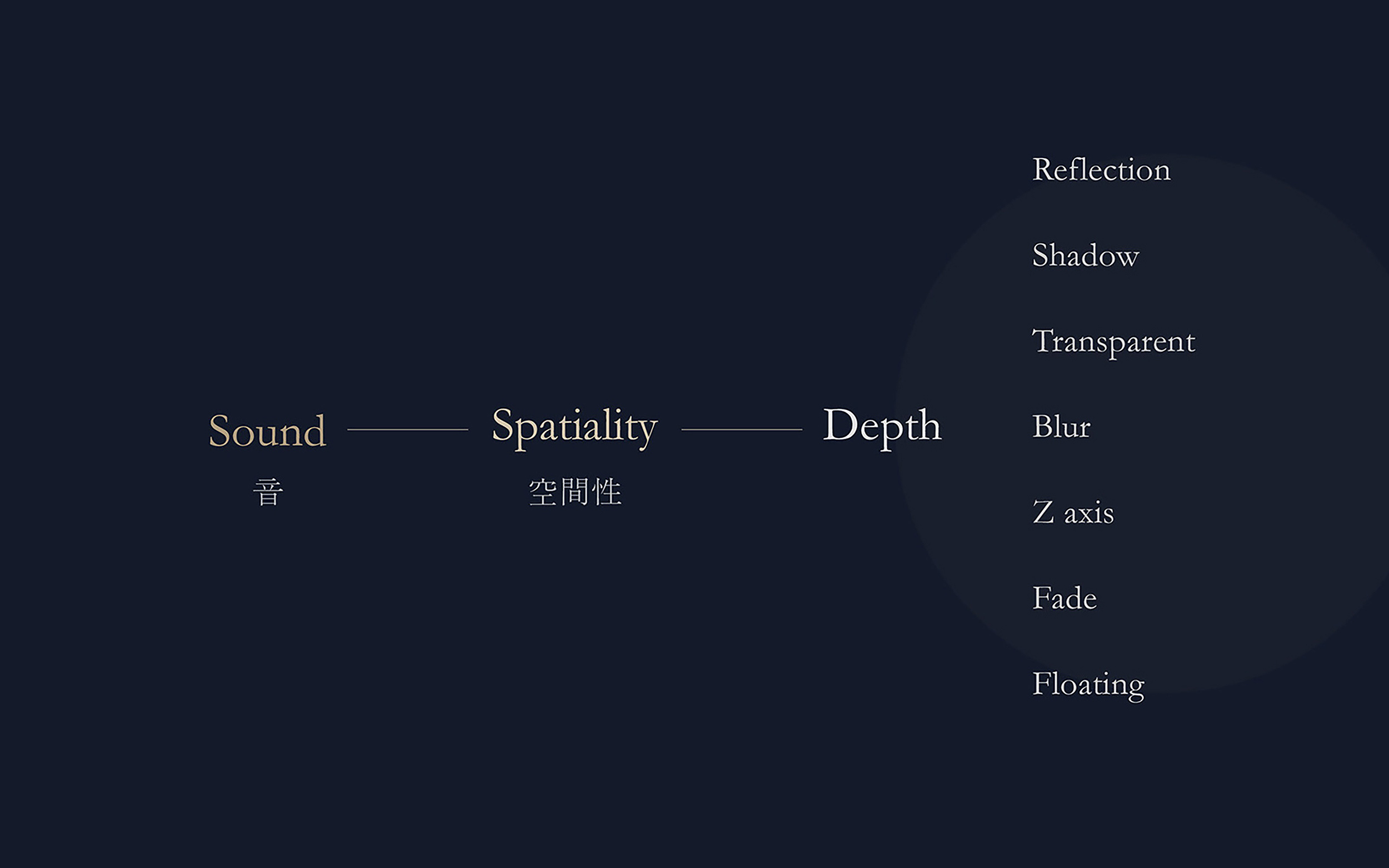
Giving sound a sense of space
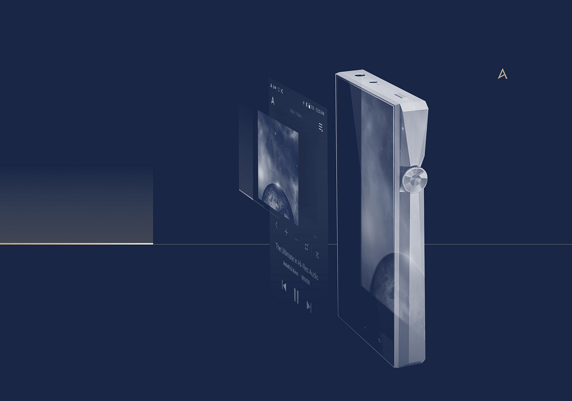
The concept started from sound itself. A good player makes music feel like it has room around it. So the UI needed depth too, built from shadows, blur, transparency, and floating layers instead of flat surfaces.
Across the main screens, stacked layers create this depth.
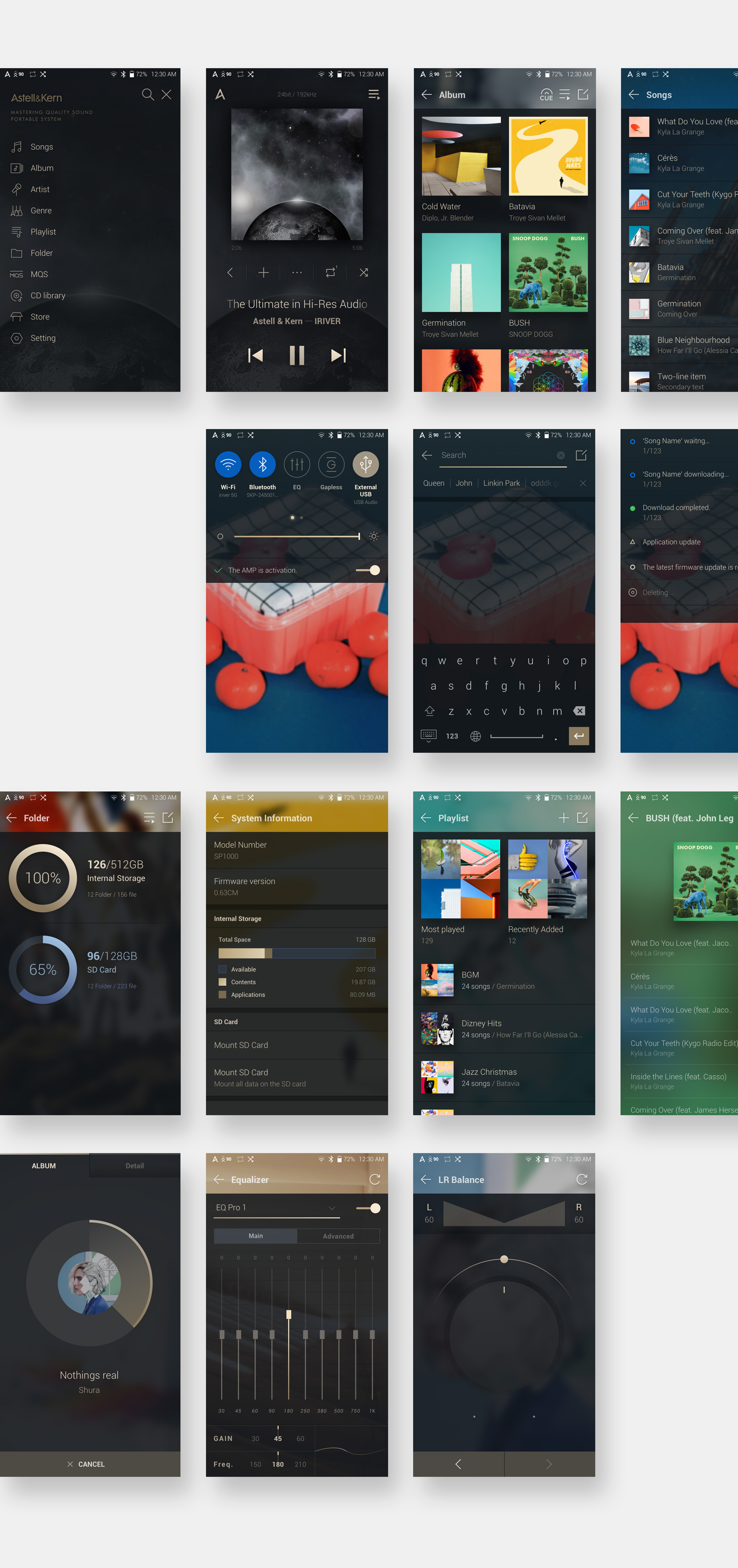

Design that reaches the smallest details
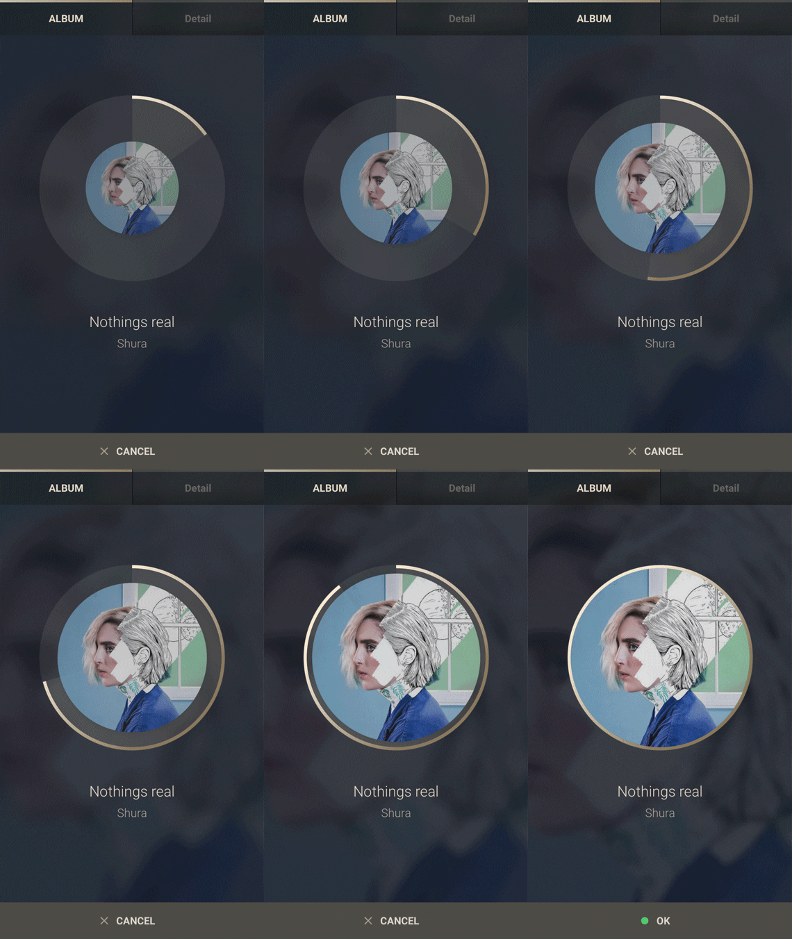
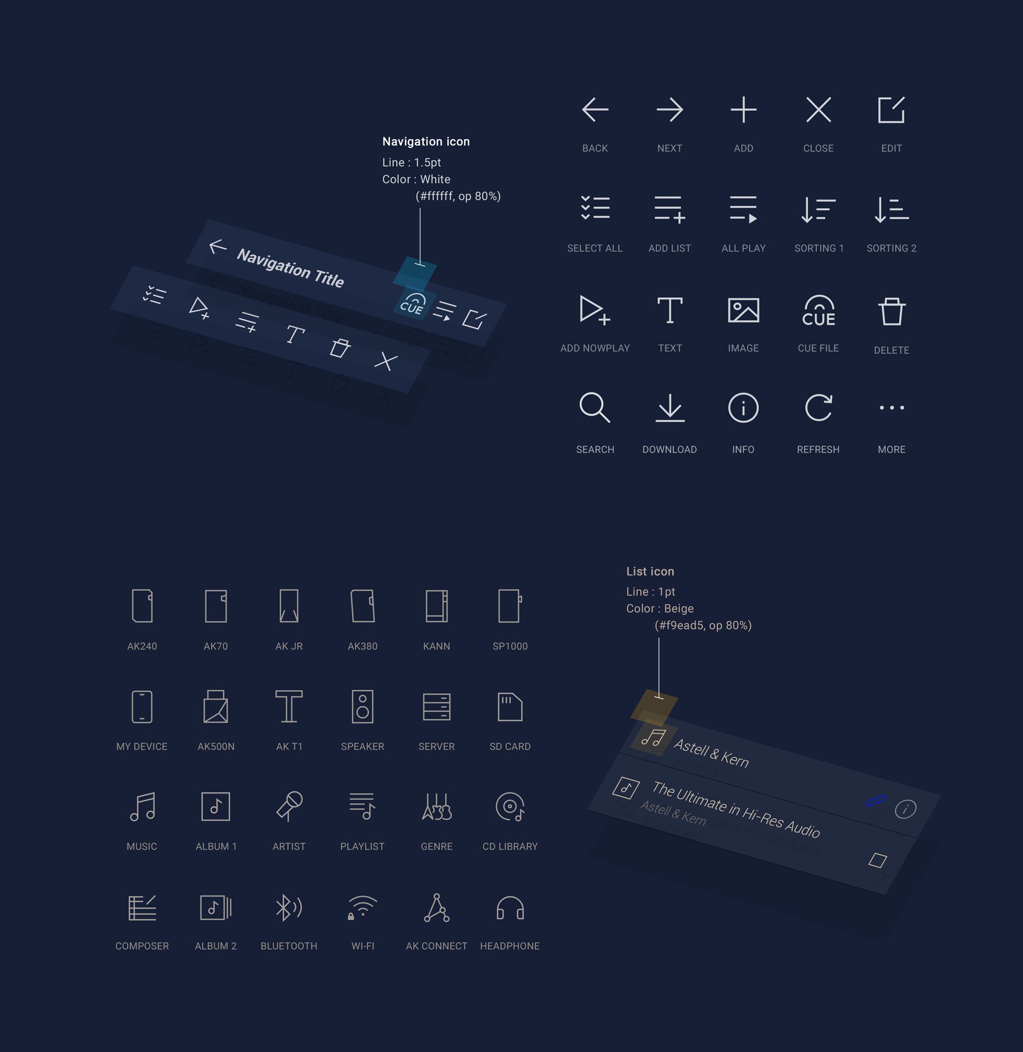
The design concept carried into small interactions too. While ripping a CD, a circular graphic that recalls the disc shows progress, and a new set of navigation icons adds consistency across the system.
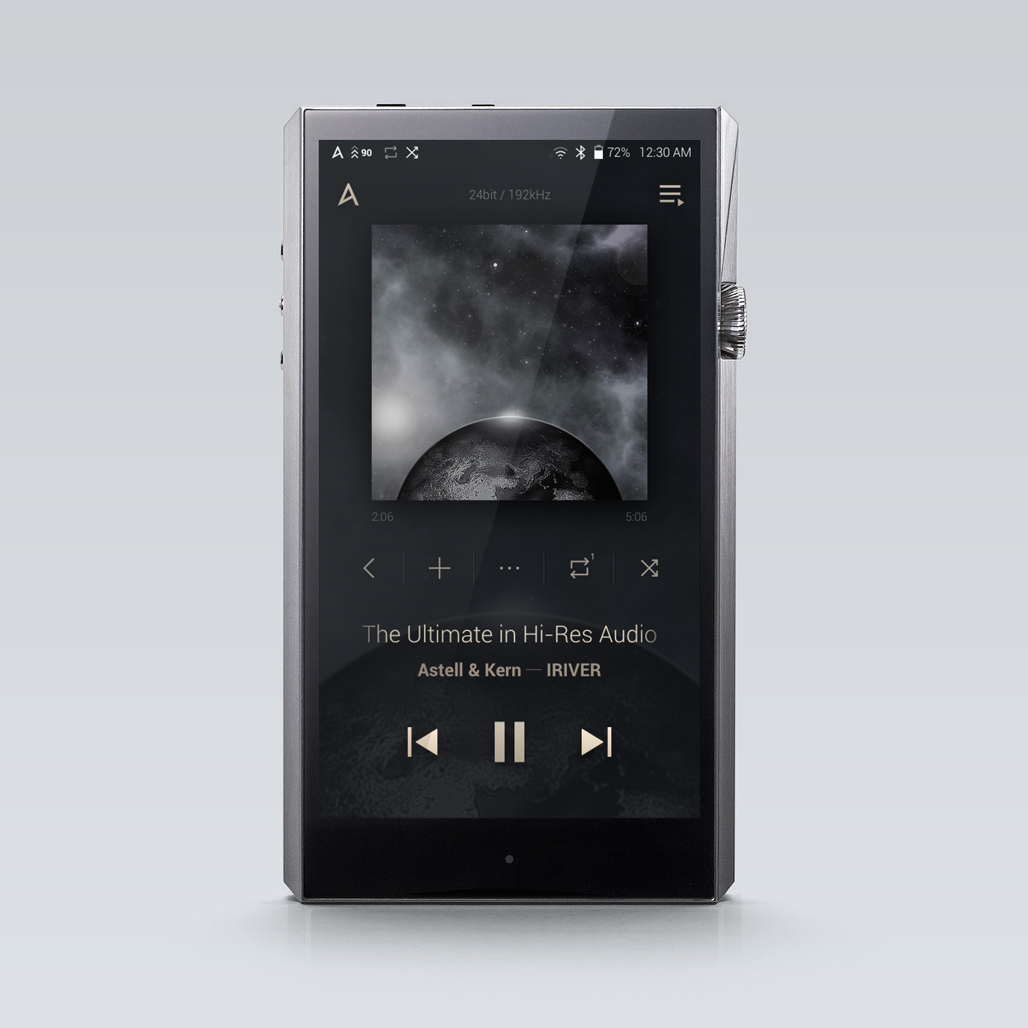
On the finished SP1000, the hardware and the UI were designed to blend naturally.
Reflection
This was my first experience of UI being the product itself. From the moment it powers on to the moment the battery runs low, I learned to design for every state a device can be in, not only the screens people choose to open.